
 The above image is a rough sketch/layout/doodle for an image I entered into a competition this summer, to design the cover for the 2010 edition of The Art Book. The Art Book is an annual illustration showcase produced and compiled by a number of agencies featuring a selection of the Illustrators they represent, which is then sent to a range of art directors and clients. You can look at the previous editions online at www.theartbook.com. (Just as a note the competition and the opportunity to have a page in the book is only open to illustrators represented by the agencies involved)
Im not sure if you can tell from this stage that the main part of the cover features a maze like what I did in 'The Amazing Giants Castle'. It even features the same boy and his dog. I appraoched this as a kind of re-interpretation/follow-up but at a more widely useful size.
From the basic sketch I expanded it to included the spine and the back cover too. See below:

To enter the competition you could enter an unfinished design, which due to a lack of time is exactly what I did. I sent the above sketch to give an idea of how the front and back cover would work. I also sent the image below, which is a more worked up version of the front cover, specifically the maze itself:

I was happy with the design at this stage, but I wasn't happy that I hadn't had time to finish it before sending it off, which made me doubtful of my chances. I was surprised however to find that my entry had gone through to the second stage and was one of the final six based on the voting to that point. All the judges then voted on the remaining six to choose the cover and although I didn't win in the end I did get runner up, which I was very happy with.
I was still happy with the design and decided to finish it so that I could use it on my page in the finished book. Below is the finished version:

Because the image was no longer going to have the back cover part, I decided to move the monster in the fog behind the island, as he was one of my favourite parts of the original design, and i wanted to keep him in. I also zoomed out a bit to both make room for the monster and to show abit more of the island and the sea. It was tricky to get right but I'm happy with the end result.
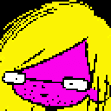
Below is a weird version that happened when I tried to upload a CMYK formated version for this blog post. I quite like it though!:


1 comment:
Well done Tom! I really like the misty painted effect of the final image!
Post a Comment